press

Seeing the Eternal in a Tumble of Tiny Letters
By Felicia Feaster for the Atlanta Journal Constitution
October 10, 2013
Tiny letters tumble through what looks like a vast, troubled sky in artist Margaret Fletcher’s paintings and works on paper. Like bodies hurling through space, e’s and o’s and l’s free fall. Is it a librarian’s lament about a written word in peril? The fever dream of a typographer? Artist and architect Margaret Fletcher’s unique, letter-based art is the focus of a memorable exhibition, “OCUS 11 ante litteram,” at the Westside Sandler Hudson Gallery. It’s the first solo show in Atlanta for the Alabama-
based artist.
“Ante litteram” translates to “before the term existed,” and Fletcher’s work often seems to speak to matters of time and existence. She manages to make a poetic connection between her abstract forms and tiny alphabet letters and the human experience. Her work suggests a collision of the human—represented by the letters—and the eternal.
Wearer of many hats, the accomplished Fletcher is a Harvard-trained architect and currently a design consultant with the Atlanta firm of Mack Scogin Merrill Elam Architects, and also an Assistant Professor of Architecture at Auburn University. If an architect’s creation lives in the world of the physical and tangible, then Fletcher’s art often feels like the inverse: ethereal and abstract. Don’t expect to decode some hidden message in the letters themselves, which won’t coalesce to spell “get out!” or “the meaning of life is …” But these artworks are apt to conjure up unexpected emotions and associations. Fletcher made her Atlanta debut in 2010 in a group show at Spruill Gallery, where her haunting, distinctive paintings featuring those letters encased in encaustic were both stark, minimalist and strangely emotional.
Working with many layers of wax that engulf her delicate letters, Fletcher’s artworks at Sandler Hudson are singularly focused on her recognizable imprints of human thought and creation: the alphabet. Using the lo-fi printing technique of dry transfer, Fletcher applies those impossibly minute insect-sized letters onto paper or canvas. She combines those letters with her more abstract forms and colors that engulf them in a primordial whirl. Encaustic works like “ante litteram 1:1” focus on dramatic, lava lamp pillars or stalactites of morphing color that flow and drip across the picture plane. Her letters sprout from those intense rust-orange furnaces or cluster into shapes that can suggest continents or maps.
It’s hard not to think of these tiny marks made by humans as stand-ins for human beings themselves, especially when Fletcher arranges them clinging in clusters to what look like tiny archipelagos in a “figura novalis,” or figure field. Letters are set against black forms in ink that look like islands reaching out into a white sea. Despite her very stark landscapes and simple forms, there is something tender and poetic about the circumstance she depicts, which seems to echo our own, of tiny figures lost in an enormous, swirling cosmos.
Fletcher’s artworks have a tension between the graphic and the metaphorical: They celebrate form, but they also evoke more ethereal pleasures. She takes something tangible and familiar in those letters and creates strange new associations. An uneasiness, but also a sense of calm is produced in experiencing the work, like finally surrendering to sleep.
Fletcher is often at her best when she is keeping things simple. Her more complex multicolor encaustic works, which often juxtapose those tiny letters with thick, topographic forms in wax, can mix a strange, otherworldly form with these emblems of civilization. But it is her more stark, clean works in black and white like “rlung,” in which black letters cluster like starlings in the sky, bunched in tight groups and then spread out against white paper, that arrest for their delicate, simple beauty. Also memorable is a series of 14 works, “azureus novalis,” in which clouds of white letters are set against soft, watery colors—muddy yellow, grey and blue—that suggest the gradations of the sky throughout the day.
In many ways, Fletcher’s work seems to evoke the act of creation, whether the artist’s or the architect’s or, on a grander scale, of the universe itself.

Textuality
By Jane Durrell, citybeat.com, Cincinnati, Ohio
March 20, 2012
“ . . .Margaret Fletcher’s blue field 5.3 (2011) and vapor 1.2 (2009) serve up white letters against two
different blues. The Alabama artist’s earlier work has letter forms so tiny one needs to lean close to
identify them, scattered like dust around the edges of the square block on which they appear. The
second uses larger letters in a topsy-turvy band across the middle of its square block. They suggest
a sense of information, unformed and ubiquitous. . . "
line field, 1:1, private collection
Engaging “Align” at Spruill Gallery draws a multimedia bead on line
By Catherine Fox, ArtsCriticATL.com, Atlanta, Georgia
March 9, 2011
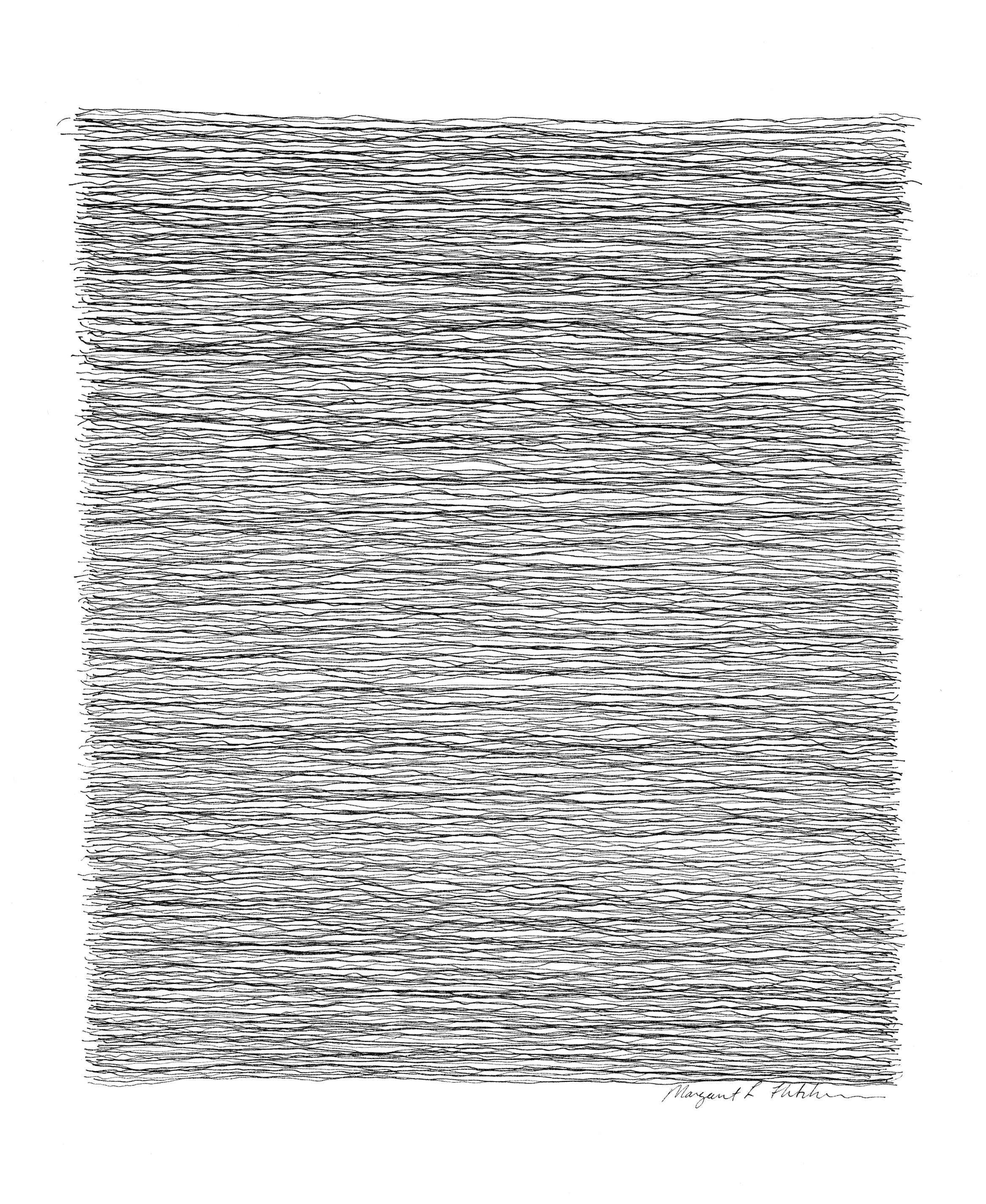
“. . .(Hope) Cohn includes examples of line as shadow, written text and metaphorical alignment, but my favorites here are your basic works on paper. Architects do most of their drawing on the computer these days, but Margaret Fletcher. . . , who practice(s) at Mack Scogin Merrill Elam Architects, (has) lost neither (her) touch nor (her) desire to put pen to paper. . .
The dominance of the horizontal in Fletcher’s drawings recalls Agnes Martin and some works by Katherine Mitchell. In the more architectural of the two series on view, she stacks super-fine straight lines to create blocky shapes — pillars? towers? — which activate the white space around them. She tries a promising new direction, introducing a bit of chaos and quirk in a drawing in which straight lines bubble, quiver and hiccup like a mischievous EKG graph as the pen moves across the page."

vapor 1:4, private collection
Emerging Artist Margaret Fletcher Finds her Way to an Impressive Debut
By Catherine Fox for the ArtsCriticATL.com
October 15, 2010
Margaret Fletcher makes an impressive debut at Spruill Gallery. Her elegant drawings and paintings achieve a meditative calm, in part by balancing opposites. Both lush and spare, they read as surface and space, and their effect is allusive and elusive.
Fletcher’s core language, as it were, is press-on letters in a crisp Helvetica script, each smaller than a coffee ground, which she positions in patterns that suggest swarms, constellations, maps or microscopic particles. As I wrote in the Atlanta Journal Constitution, “The letters are fixed, like insects in amber, by layers of milky, translucent encaustic (wax), sometimes infused with an aqueous blue-green. her application is so extremely thin and smooth that it makes other encaustic paintings look vulgar.”
Fletcher is an architect. She came to town eight years ago to work for Mack Scogin Merrill Elam Architects, where she is a project director. Shortly thereafter, an artist friend suggested that she make an artwork to put into Art Papers magazine’s annual auction. Fletcher, whose drawing experience had centered on architectural renderings, made an abstract piece using what was at hand: press-on letters, an architect’s pre-computer staple. It sold.
For the next six years, she contributed one piece a year to the auction.
She would station herself nearby watching viewers try to find meaning or code in the letters, pleased to observe that her drawings were not, as she says, “figureoutable.”
Fletcher grew increasingly more focused on art-making as the years progressed, learning waht she wanted to do by doing it. She was, for example, having difficulty creating depth, because the fragile letters would clump together if they overlapped. She learned about encaustic while helping an artist friend spread wax on sculpture, as saw it as
a solution.
Fletcher uses the encaustic to fix and coat the letters so that she can add layers on top. She makes these pieces on a thick wooden support, which creates a different feeling from the works on paper, not only because they are more object-like but also because there’s no glass between the viewer and the filmy surface.
Eventually, Fletcher felt serious enough about making art to apply for a studio at The Atlanta Center for Contemporary Art. She’s been working there for a year and a half. The works-in-progress displayed during the Contemporary’s recent Open Studio night represent her experimentation with brighter, contrasting colors, such as a rusty orange and blue, and with solid shapes.
Fletcher’s exacting, rigorous process bespeaks her architectural training. She is, as she says, an architect through and through. But making art gives her something that her profession doesn’t. “Architecture is a collaborative process,” she explains. “This is something that’s my own. It’s very private, and its very satisfying in a way that architecture is not.”
A woman who has designed and built guitars as well as programmed computers clearly has an aptitude for many creative endeavors. If her ability to balance competing elements in her drawings and painting is any indication, Fletcher will surely find a way to reconcile her pursuit of art and her practice of architecture so that each enhances the other.
“OCUS,” FLetcher’s solo show, is on view at Spruill through October 30.

Gallery Review: ocus
Catherine Fox, Atlanta Journal Constitution
Friday October 8, 2010
“ . . .Margaret Fletcher makes a stunning debut in her exhibition of drawings and paintings. She composes these ethereal abstractions using press-on letters that are no bigger than the head of a pin. She has the crisp Helvetica letters specially made and places them with the precision of an architect, which she is, who knows that God is in the details.
The letters are fixed, like insects in amber, by layers of milky, translucent encaustic (wax), sometimes infused with an aqueous blue-green. Her application is so extremely thin and smooth that it makes other encaustic paintings look vulgar.
These small works may evoke the stars in the night sky, swarms of microscopic beings, or other naturally occurring patterns. In one series, the letters hover at the edges, a suggestion of dispersal.
Mostly, they are elegant, meditative and really, really, beautiful.”